
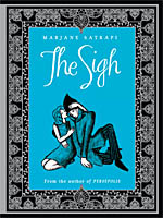
 By Marjane Satrapi
56 pages, color
Published by Archaia
It would be a reasonable assumption to feel that Marjane Satrapi’s new book, The Sigh, is a comic. After all, she’s best known for her comic Persepolis (which was created into an excellent animated film), and has continued to work in that medium since then. The Sigh is an illustrated story book, though, showcasing her drawings but pairing it with prose instead of panels and sequential art storytelling. It’s a charming book, though, one that mixes elements from several different familiar fairy tales and turns them into a greater whole. The Sigh borrows the most from Beauty and the Beast, with the merchant promising to bring back presents for his daughter, and the mysterious castle with the secretive person inside. Almost immediately things change, though; Satrapi gives Rose (the Belle stand-in) an interest in botany as part of her request for a gift, and one gets the impression that this is going to be a smarter and slightly more daring take on the story.
As the book progresses, Satrapi throws in several curveballs that will no doubt surprise readers. In particular, there’s a casual attitude to slavery that might throw Western audiences for a loop, even as subtly reminds them that this is a book born not only out of fairy tales that we grew up with, but ones that Satrapi did as well. The Sigh becomes episodic in nature for the second half, but it’s to Satrapi’s credit that she also keeps it from going on for too long; by the time you see the pattern forming, she’s cut it off at the knees and moved on to the conclusion. Readers might be a little disappointed to not get a full graphic novel from Satrapi, but her art is still soft and charming—at times it looks almost like it was (expertly) drawn in crayons, which helps the fairy tale nature of the book—and in the end it’s satisfying in its own right. Satrapi takes the familiar and makes it just unfamiliar enough that it will have your attention from start to finish.
Purchase Links: Amazon.com | Powell’s Books
 By Natsume Ono
 By Renaud Dillies
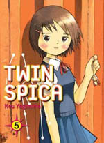 By Kou Yaginuma
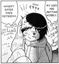 Still, the primary draw for me remains the training for space, and after meandering away from it for a while, the second half of the book is taken up primarily by a training exercise that the entire class goes on. It’s actually one of my favorite parts of the series to date, with what seems like a simple simulation suddenly turning into a much more challenging event. Child-sized Asumi is our main focus here, and I appreciate the fact that Yaginuma is able to cast doubt into the reader’s mind on if she’s really cut out to be an astronaut. Considering she’s our main character, the fact he can plant that doubt is a good one. His delicate art style assists in that manner; watching the battered Asumi stumble through the challenge wouldn’t be half as effective if she seemed buff and sturdy. With its twin love affairs of childhood romance and the yearning for space, Twin Spica continues to draw its readers in, and is worthy of staying on your radar. If you ever wanted to be an astronaut, you’ve got to read this series.
 Compiled by Robert Schnakenberg
 Needless to say, all of the obvious ones are there: Superman #1, Action Comics #1, Detective Comics #27, Flash Comics #1, Green Lantern #1, Adventure Comics #247, The Flash #123… but so many more are present, too.
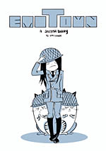 By Emi Lenox
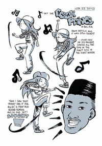 It felt to me like it was a piece of paper that Lenox was trying to fill up, and does so with random moments and scenes shoved in to avoid a large void of white space. Her art style at this point feels slightly nebulous, too, with thin lines and an almost flat look to her pages.
 Written by Joann Sfar and Lewis Trondheim
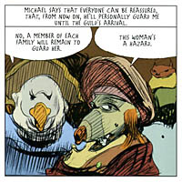 The first half, Heartbreaker, is set during The Early Years timeframe, taking supporting character Alexandra and showing us just how this beautiful assassin’s mind truly functions. It’s a slightly unpleasant story, with her continued captures and tortures not being a light or happy tale by any stretch of the imagination. It’s drawn by Carlos Nine, and I wish that he’d had the time to paint the interior like he did the book’s stunning cover. The interiors aren’t bad, but his loose lines and sketchy character designs just can’t compare to the cover and all of its beauty. Nine drawing Heartbreaker is an inspired choice, though; Alexandra spends much of the comic drugged by her enemies, and this slightly blurry, loose style is a great match. Readers of The Early Years definitely shouldn’t skip this volume, though; it ties closely into the main narrative, and Sfar and Trondheim provide a big surprise for readers of that series at Heartbreaker‘s conclusion.
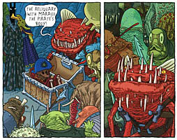 The second half, The Depths, is drawn by Patrice Killoffer, whose precise and smooth ink line is a dramatic contrast to Nine’s work. And while the first half was grim in a hazy sort of way, there’s no escaping the sheer nastiness of this story when Killoffer draws its events. This is easily the most (deliberately) vile and horrible story in the Dungeon milieu to date, as the poor underwater creature Drowny goes through all sorts of nasty situations in order to survive when the Great Khan’s armies invade. There’s a huge amount of detail packed into every single panel, but be warned that you might not want to look too closely. This story is designed to repulse its reader, and at that it succeeds mightily. Dungeon Monstres Vol. 3: Heartbreaker seems to see just how low it can go, and while I applaud it for succeeding, it’s the one Dungeon book I can’t see myself wanting to ever re-read.
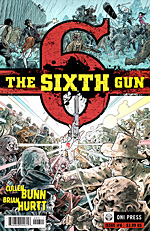 Written by Cullen Bunn
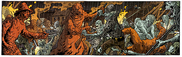
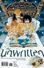 Written by Mike Carey
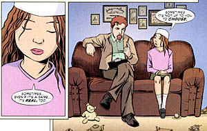 It’s also nice to see that even when given nothing fantastical to drawn, Peter Gross is able to deliver in spades. Sure, some scenes set in the prison play to what you’d expect from Gross’s art; lots of stonework and sharply constructed buildings, even amidst doom and gloom. I like the quieter moments that Gross draws here, though; Cosi at the therapist gives her a strange mix of resignation and faith about her, and watching Chadron interact with his children makes him feel that much more human as you see the conflict play out on his face. If you aren’t reading The Unwritten, the first collection is due out in early January 2010 and it’s well worth your while. Easily one of the best new series of 2009. Check it out.
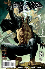 Written by Paul Cornell
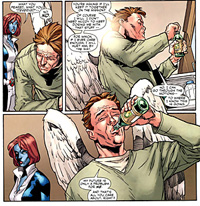 Kirk and Leisten’s art is almost as I remembered it, but with some slight changes. On the bright side, they’ve still got a solid sense of layout and basic character structure. I like how Kirk never loses track of these being both superbeings and every-day people, giving them full wardrobes and every day objects. On the other hand, the number of old-looking, wrinkly faces in Dark X-Men is a little odd. I don’t recall Mimic looking like he’s in his mid-50s, so I’m not sure what’s going on here. Still, Kirk and Leisten nail the really important scenes, like a massive brain composed of the bodies of psychics, or Omega’s momentary anguish as he wonders if he’ll remember his new-found resolve.