
 Story by Viktor Kalvachev and Kosta Yanev
Script by Andrew Osborne
Art by Viktor Kalvachev, Toby Cypress, Nathan Fox, and Robert Valley
24 pages, color
Published by Image Comics
With three writers and four artists attached to the first issue, it would be understandable if you thought that Blue Estate was an adaptation of a movie, or perhaps a video game. As it turns out, it’s not, but rather a comic that shifts its visual style on a regular basis, while telling a present day crime noir, (semi-)hardboiled detective story. And while it’s it not a bad debut, I do worry that at times Blue Estate #1 feels like it’s trying to get a little too clever for its own good.
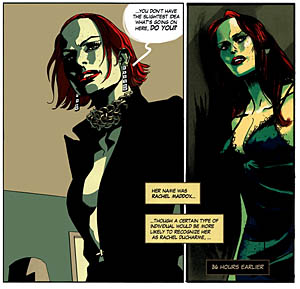 Blue Estate #1 opens with a series of classic crime noir elements; the private detective, the beautiful (and secretly famous) woman entering the office, the dangerous husband. Viktor Kalvachev and Kosta Yanev’s story clearly understands what it’s doing there, evoking all of the archetypes so that you know exactly the kind of story you’re getting yourself into. At the same time, though, Kalvachev and Yanev (along with scripter Andrew Osborne) pokes a bit of fun at it, using the Law & Order opening narration and then giving a verbal swerve away from those classic phrases. Suddenly the detective is playing a Wii, and instead of the tall thin and craggy detective we’ve got the short, dumpy, nerdy guy.
The problem is that the tone of the comic is a little too "gotcha!" and a little less, "We’re using a different kind of set-up than you’re used too." It comes across as incredibly self-aware and pleased, and it’s a distraction from the rest of the comic. I appreciate that Kalvachev, Yanev, and Osborne are trying something different here, but the point could have been made without the goofy expression as Roy gets pulled out of his chair, or the "Dun Dun" jokes regarding the Law & Order signature two-tone. It’s a joke that’s set up, executed, and then slaps you in the face in case you weren’t paying attention.
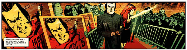
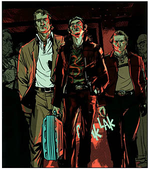
Part of the problem is that at the end of the first issue, it’s all just prologue. We’re introduced to a cast of characters, but no one is on-panel long enough for you to get more than the absolute basic stereotypes from them. Roy’s a big geek. Bruce is the dangerous husband. Marcellus and his partner are the muscle. And so on. And so on. I understand that the economics of the comics industry are such that having each issue at 32 pages might have been too expensive for a brand-new title, but as a debut issue if there was ever a time for some extra pages, this was it. It’s hard to find things to latch onto this early in the game and make you dying for more. You can see a lot of promise in Blue Estate—Kalvachev, Yanev, and Osborne clearly love the genre—but in some ways this feels less like a first chapter and more like a movie trailer. We’re getting lots of snippets to catch your eye, but there’s not a whole story or even a substantial chunk of one just yet.
 With four different artists drawing a 24 page comic, chances are high that there’s going to be a lot of inconsistency, but it’s to Kalvachev’s credit (who is also listed as the art director) that he’s assembled four artists who work together so well. While none of them seem to particularly draw like one another, they all follow the same basic look for the series. It admittedly helps that Kalvachev colors not only his but the other contributors, but all four have a certain dark, murky look to their art. Everyone has a slight element of cartoonish nature to their art, too, and it’s those small exaggerations which keep the book lively. Still, readers will be able to tell the moment the book shifts from one artist to the next. Nathan Fox (whose art I’m used to thanks to DMZ and Runner’s World) thanks to the little squiggles in his art that show up in a character’s hair or around the edges of their face, for example. And each artist in general has their own slightly different takes on the cast; Rachel, for instance, shifts slightly in age, and style of dress (especially the amount of cleavage being shown off) from one artist to the next. Having four artists draw each issue is an interesting approach, and all four clearly have talent, but I do wonder if it might’ve been better to just have each artist tackle a different issue rather than jumping from one to the next.
Blue Estate #1 is an interesting book; it’s on the right path to doing a lot of things right, but it keeps taking little swerves in either direction. In some ways it feels like it’s just trying too hard. If the book stopped playing the self-aware game and shifted down the number of artistic jumps in a single issue, I think it could click together perfectly. Right now, though, it falls into the realm of promising. For fans of crime noir, it’s definitely worth a gander. For those not already predisposed to love the title, though, it’s a comic that has some final polishes ahead. Hopefully it’ll get there quickly.