
 By Scott Morse
28 pages, color
Published by IDW
One of the things I like about Scott Morse is that you never, ever know what you’re in store for. He jumps genres and formats faster than people can keep up, and often morphs his art style to match. So when I picked up a copy of Strange Science Fantasy #1, the only thing for certain I knew was that the cover reminded me a lot old B-grade movie posters. Turns out that’s more or less what was waiting for me on the inside, too.
The best way to try and describe this issue of Strange Science Fantasy would be, "Race car pulp science-fiction cyborg apocalypse." And I’m sure I missed a few nouns and adjectives in there, because I think that only touches the tip of the iceberg. Any comic that shifts from car racing, to a driver being able to shine laser light out of his new cyborg head, to warring groups of gearheads is not your typical comic, after all. Strange Science Fantasy feels like a comic where Morse is just throwing as many crazy ideas into the mix as he can, then distilling them all down into a single issue.
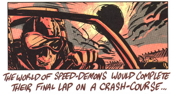
The writing of Strange Science Fantasy #1 is entirely through narration; it feels more like you’re watching a documentary about the great gearhead wars instead of a present tense story. There’s no dialogue, just Morse explaining what happened throughout each stage of the uprisings and battles. The upside to this storytelling decision is that it lets Morse cover a lot of ground in just a few pages, moving forward at a fast clip that in many ways defines the story’s overall feel. The downside, though, is that it’s not a technique that lets you get close to any of the characters. With no dialogue and no resting on any specific scene, the action just whips on by with no strong focus to let you get to know them. They’re defined here entirely by their silent actions, not getting to know them on a personal level.
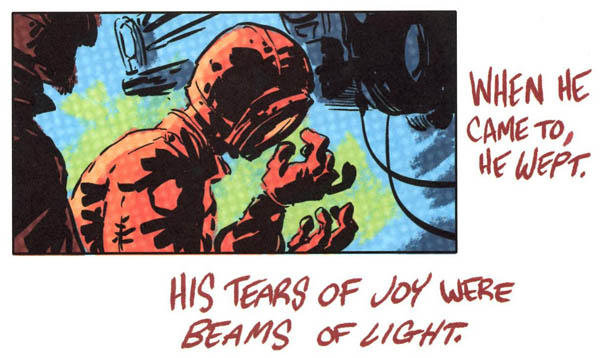
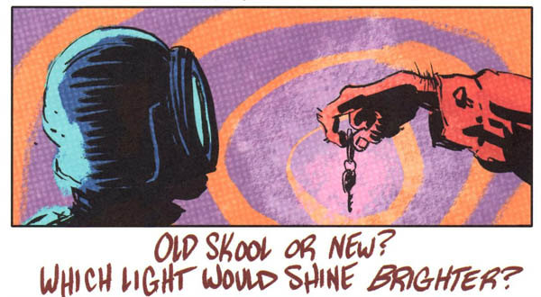
Morse’s art is as great as always. Here, he’s gone for a rougher, looser style that keeps bringing to mind those old movie posters. Those ragged drawings, though, don’t keep there from being a lot of emotion on the faces of his characters, and a lot of strong and powerful energy during the race and fight scenes. In those introductory panels where we first meet the world of Strange Science Fantasy, just a simple panel with the driver gripping the wheel shows his tension and concentration as he does so; it’s a great example of what’s to come. Morse also uses his color choices wisely throughout the book; while it primarily uses orange (an uncommon choice), he mixes it with blues, greens, and purples in a way that makes everything just pop off of the page. Most (but not all) panels are "widescreen" formatted, with narration right below the panel. It’s an interesting choice that works for his "documentary" style of storytelling, although if this had been written in a more standard way I suspect we’d have seen a very different series of layouts.
Strange Science Fantasy #1 is a fun, if slight, comic. At the end of the day, it’s the big ideas (cyber-elephants!) and the art that make me want to see more, even while the overall writing style is just all right. It’s cool enough though that I’m all right with that. And if you need an extra lure, well, there’s a one-page backup strip by Paul Pope about the creation of Headlight that makes me think Morse is a great choice to color any future Pope artwork. If you’re a Morse fan, you’ll want to take a look at this.