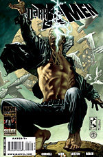
 Written by Paul Cornell
Penciled by Leonard Kirk
Inked by Jay Leisten
32 pages, color
Published by Marvel Comics
Having greatly enjoyed Paul Cornell, Leonard Kirk, and Jay Leisten’s collaboration on the short-lived Captain Britain and MI-13 series, it was nice to see the proverbial band get back together for Dark X-Men. What seemed like a shameless attempt to try and mix two best-selling words at Marvel ("Dark" and "X-Men") has turned out to be a pleasant surprise, almost a cross between Suicide Squad and Thunderbolts. Cornell mixes the pitiable, pathetic, and putrid characters into a dysfunctional team that in just two issues is on the verge of exploding, but in such a way that you can’t automatically assume that either they’ll get solidly back together at the conclusion, or lie scattered about in ruins. It’s strange and unpredictable, and Cornell’s clearly having a blast with the book.
 Kirk and Leisten’s art is almost as I remembered it, but with some slight changes. On the bright side, they’ve still got a solid sense of layout and basic character structure. I like how Kirk never loses track of these being both superbeings and every-day people, giving them full wardrobes and every day objects. On the other hand, the number of old-looking, wrinkly faces in Dark X-Men is a little odd. I don’t recall Mimic looking like he’s in his mid-50s, so I’m not sure what’s going on here. Still, Kirk and Leisten nail the really important scenes, like a massive brain composed of the bodies of psychics, or Omega’s momentary anguish as he wonders if he’ll remember his new-found resolve.
If you’re like me, you’ve gotten sick and tired of all the various "Dark" titles being published at Marvel and are eager to see them all go away. That said? If there’s still a group of characters to return to, more Dark X-Men would be a treat if it’s Cornell, Kirk, and Leisten on board. This is more than a simple, one-note concept in their hands.

 By Berkeley Breathed
 By Natsume Ono
 Written by Brian Azzarello
 By Daisuke Igarashi
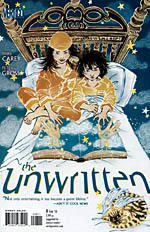 Written by Mike Carey
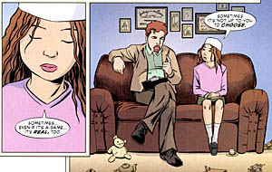 It’s also nice to see that even when given nothing fantastical to drawn, Peter Gross is able to deliver in spades. Sure, some scenes set in the prison play to what you’d expect from Gross’s art; lots of stonework and sharply constructed buildings, even amidst doom and gloom. I like the quieter moments that Gross draws here, though; Cosi at the therapist gives her a strange mix of resignation and faith about her, and watching Chadron interact with his children makes him feel that much more human as you see the conflict play out on his face. If you aren’t reading The Unwritten, the first collection is due out in early January 2010 and it’s well worth your while. Easily one of the best new series of 2009. Check it out.
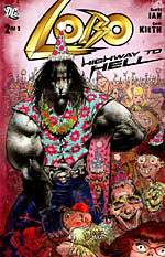 Written by Scott Ian
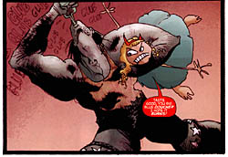 Lobo: Highway to Hell is a two-issue mini-series that manages to shoot its credibility on the first page. How else can you talk about an opening line of, "Head feels like Motorhead is raping it," after all? Between that and mentions of the television show Lost (no, really), it’s the first sign that something is slightly off. From there we get unfunny jokes stretched out into dozens of pages, and an entire second issue where Lobo in Hell is supposed to be funny, but it’s really just the reader in Hell because the issue never seems to end. Kieth’s heart doesn’t appear to be in this either; I understand that sometimes Kieth deliberately devolves his style, but Lobo: Highway to Hell looks like it was drawn on a napkin more times than not. This comic is embarrassing for DC Comics as a publisher. Don’t fall into the same well of regret that I’m currently floundering in. If you haven’t made that mistake already, avoid this book.
 By Masayuki Ishikawa
 Written by Ted Rall
 Written by Matt Fraction