
 Written by Charlie Huston
Art by Lan Medina
32 pages, color
Published by Marvel Comics
Just how many times can Marvel revamp a character concept? The original Deathlok dates back to the 1970s, a cyborg warrior from the future. Since then we’ve had a new Deathlok in the early ’90s helmed by Dwayne McDuffie, Gregory Wright, and Jackson Guice (that I still remember fondly), and the late ’90s had yet another Deathlok in Marvel’s M-Tech line in a series that lasted less than a full year. But now there’s another attempt to do something with the basic character idea, under the Marvel Knights imprint. And while this Deathlok the Destroyer looks beautiful, the story itself is an unfortunate combination of predictable and slow.
 Charlie Huston is setting his Deathlok in the near future, where war is a sport that people watch on the television and cheer on their favorite soldiers, complete with product placements and celebrity. The problem is, it’s nothing that we haven’t seen before; this level of satire isn’t breaking any boundaries, in comics or any other type of popular media. So with the basic concept not particularly attention grabbing, Huston’s script is going to have to do the heavy lifting, and that’s where I think Deathlok #1 falls down. There’s almost no characterization here, just lots of macho chest-thumping, and swear words turned into hash mark symbols every other sentence. I don’t care about any of the characters by the time the first issue is over; not our hero, not the villains, not even the supporting cast. As the first chapter in a graphic novel this approach could work because you already have the entire story in front of you, but as the start of a serialized work it’s a bad decision.
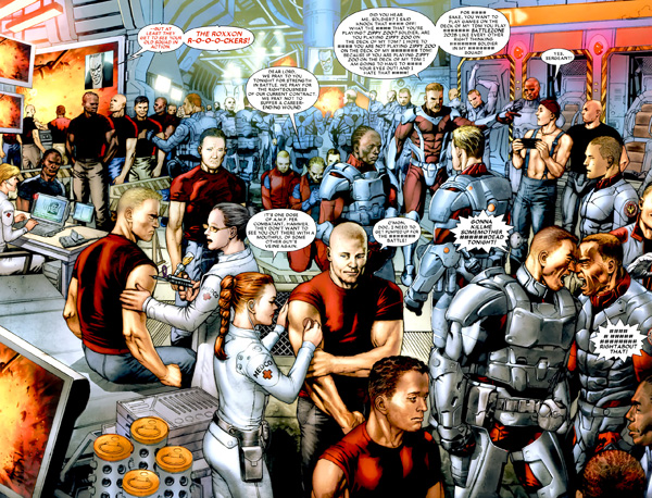
The sad thing is that Lan Medina’s art looks beautiful here and is wasted on this comic. I know he’s drawn some Punisher MAX issues in recent days, but seeing his delicate, carefully sculpted art feels out of place in a kill zone. While Medina’s art here reminds me a bit of Greg Land’s figures, it doesn’t come across quite so posed or lightboxed; characters have beautiful bodies and a lot of fine detail added to their faces, but they still move across the page in a way that looks natural. Brian Haberlin’s colors sync up with Medina’s art perfectly, adding to that gentle, easy feel. Haberlin helps toughen up the war scenes with harsher hues and shades saturating the panels, and that hazy orange glow of dust goes a long way towards making Medina’s art look rougher than it actually is. But still, even then, the whole time I read Deathlok #1 I kept thinking that it seems strange for the artist of Fables and Aria to be drawing Deathlok the Destroyer.
My immediate thought upon reading Deathlok #1 was, "You’d have thought Deathlok would have shown up at some point in time." In the end, Deathlok just plods slowly towards the finish line. There’s no spark, no excitement, nothing that made me sit up in my seat and think, "This is it, I’m glad I read this." There are some good Deathlok comics in the past, but this one doesn’t seem to serve any real purpose. I wanted to like it, but for now it’s leaving me cold.