
 By Veronique Tanaka
64 pages, black and white
Published by NBM
There are times when the back cover copy to a book can actually be a turn-off. Let’s take Veronique Tanaka’s debut graphic novel Metronome, which states, "Just when you thought that nobody could create something new in the comic medium, here comes Metronome […] a ‘silent’ erotically-charged visual poem, an experimental non-linear story using a palette of iconic ligne clair images. Symbolism, visual puns and trompe l’oeil conspire in a visual mantra that could be described as ‘existential manga’…" Now maybe I’m in the minority here, but this sounds so snooty that my first reaction was to not want to read it. Honestly, if it hadn’t been for the introduction by Jeff Smith mentioned on the front cover, I might have passed it by. But you know something, I’m glad I took the time to read it—despite the best efforts of the copy writers.
A man is sitting alone in his apartment, as a metronome ticks relentlessly in the background. As he stares into space, though, you start to see the memories unfolding inside his head and discover why the objects in the room mean so much to him. They’re all connected to the girlfriend that left him, and it’s that doomed relationship that is internally playing out for him, once more…
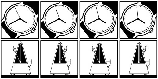
Tanaka’s graphic novel is composed entirely of 4×4 grids of panels, all uniform in length. When you see its first page being nothing but panels of a metronome ticking away, it’s an easy reaction to roll your eyes a bit. Once I actually started reading it, though, I began to see what she’s doing with her writing, here. She’s setting the beat, letting you see the metronome relentlessly tick back and forth until you have the rhythm firmly in your head. As the pages unfold, the metronome starts getting replaced with other items, but still with that methodical beat driving the page. Slow zoom-outs on specific objects for four beats, slowly revealing what and where they are, each establishing a bit more of the scene. By the time our nameless man appears, you not only have a strong idea of where he is, but also firmly have a "1, 2, 3, 4" count moving through your head.
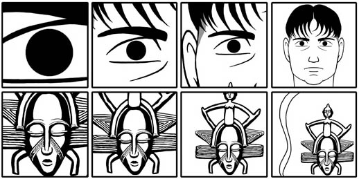
The story itself is interesting in that Tanaka’s able to play a bit with our preconceptions of what happened to make this man so miserable. As his girlfriend appears in his life, things that are slowly revealed may cast a different light, and you begin to learn what really broke them up. It’s hard initially to tell what sort of expression is on his face—is he angry? sad? regretful? seething?—and I appreciate that because of the wordless nature of the book you can make a strong point for any of those being his final reaction on the matter. On the other hand, while Tanaka’s use of the male character’s face is a bit subtle, the same can’t be said for some other parts of Metronome. The reasons for the actual break-up seem remarkably clichéd and makes out the other half of the party to seem almost a bit saintly, to the point that it feels like Tanaka is placing herself as one of the characters in the book. (Whether that’s true or not is anyone’s guess, but it’s hard to avoid that feeling.)
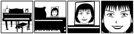
Tanaka’s art is certainly good, but a little stiff. Tanaka uses stark, curved lines to create her characters, and when it comes to a portrait this works well. It’s only when you see more and more of her work that a certain sameness becomes more and more evident. I’m not 100% sure if Tanaka is using a computer to draw a dozen or so poses for characters and items and then re-use them, but I certainly got that impression here. It would certainly explain the stiffness in her characters, though, with them coming across unchanging from one panel to the next because the exact same drawing was used time and time again. Tanaka’s strength is definitely the tight focus that each panel has, using it almost like a television camera. By controlling exactly what the reader sees and keeping that focus fixed and narrow, it helps move the story along quickly and effortlessly. It’s a strong usage of a 16-panel grid, and I’m impressed that Tanaka never needed to break that pattern. I was a little surprised at first that the book’s contents are all rotated 90 degrees counter-clockwise, but after a brief moment I realized that Tanaka was making sure that people don’t treat the book as two-page spreads, reading across the top rows of panels of both pages as if it’s an 8×4 grid. By turning the book on its side, it keeps people reading in the right order, which made it a smart move for presentation.
Metronome is ultimately a book that I’m glad I read; while it may be a little rough in places and in need of some fine-tuning, it’s an interesting experiment and a good method of story-telling. Ironically I think the worst thing about Metronome is really the pompous back-cover text that crows about how good and innovative Metronome is. Don’t get me wrong, it is worth reading, but a little humility goes a long way, here. If Tanaka does another book down the line, I’ll be interested to see what she does.
Purchase Links: Amazon.com