
 Written by Matt Fraction
Art by Gabriel Ba
20 pages, two-color
Published by Image Comics
So many books being published right now seem to be taking the wrong tactic to hook readers. The current trend seems to be “decompressed” storytelling, giving yourself additional space to slowly let everything unfold. The problem is that if you aren’t really good at this technique, it backfires and gives the reader an impression of nothing happening. I think what initially grabbed me about Casanova is that this book seemed to almost be flipping decompression the proverbial bird, reminding people that there’s another tactic waiting to be taken. Just how much can you pack into a single comic?
Casanova Quinn was once an agent of E.M.P.I.R.E., going on missions dictated by its director: his father, Cornelius Quinn. Living in the shadow of his father as well as E.M.P.I.R.E.’s star agent—his twin sister Zephyr Quinn—seemed to be a way to send Casanova to an early grave, or at least a mental breakdown. Then an opportunity presented itself that let Casanova start over, in more ways than one. Now he’s the superstar secret agent that he never could have been. And all he has to do is betray E.M.P.I.R.E. to their greatest enemy.
While regular issues of Casanova contain 16 pages of story and art, the series opened with an extra-sized 28-page extravaganza and honestly, more happens there than in some entire 200-page volumes of comics. Matt Fraction seems determined to give the reader whiplash, piling on ideas and events almost faster than you can take it in. I say almost, though, because Fraction’s clearly making sure that the reader can still keep up. Every time the reader is threatened with being overwhelmed, the story pauses briefly, letting everyone once more gain a sense of where they are and what’s going on before continuing. Maybe even more important is that there’s a real sense of style in Casanova. The titular character’s narration is a nice mix of sarcastic and incredulous, bringing you along the journey with him at all times. Likewise, the little “asides” from different characters along the way to give the reader additional information could’ve come across badly, but here they’re fun and appear only often enough that they never get annoying.

None the less, I’m really not kidding when it comes to how much is packed in here. Casanova’s first two adventures are full of the proverbial twists and turns, keeping the reader guessing and jumping as the story fully unfolds. There’s a lot going on here, from crazy mad science to spy theatrics, all working in unison. It’s every young boy’s dream, a combination of swashbuckling bravado and leaping across timelines and fighting an army of androids. It’s goofy macho fun, with just the right touches of emotion to ground the book with just a bit of reality. As great as all of the big events and ideas in the book are, Fraction knows when to put them all aside for a minute. When Casanova attends a funeral in the first issue, for instance, there’s a wonderfully effective scene where he’s surrounded by blank word balloons, his emotional state being portrayed perfectly in both writing and art in the book. And then, once the moment is over… the book hits the ground running all over again.
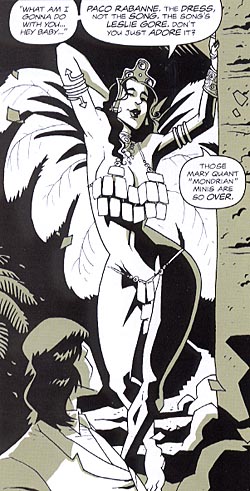 Gabriel Ba’s art is well suited for Casanova, which is important because Fraction’s scripts put a lot of demand on the art. In a book where the average number of panels on a page is seven but can go as high as thirteen, there’s a lot of storytelling to do in a very restricted space. He’s got a good idea as to how much or little should be put in the panel to keep things from getting overwhelming, and the action moves easily from one shot to the next thanks to a good understanding of body language. People move and look like real people, with just the right head tilt or posture to bring everything across. Ba also uses the green color well to his advantage, letting it provide a lot of texture and shading that a strict black-and-white book couldn’t.
I’m really happy with Ba’s figurework in Casanova. There are scenes in the second issue where we see a lot of flesh on display (first Zephyr in a skimpy outfit, then Casanova and the bad guy having to fight while naked) and Ba makes them both attractive and realistic. We’re talking about reasonable sized body parts, and with muscle and flesh and fat on display—and these are all clearly fit characters. It’s a pleasant change of pace from what is so often served up in comics. Add in some fun fashions for when everyone is fully clothed (or partially, in the case of Zephyr’s outfit in issue two) and these are some sharp visuals for the reader to enjoy.
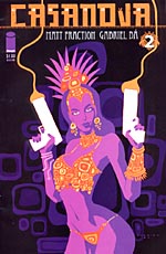
We’re only two issues in and already the end of each issue has Casanova at a very different point or frame of mind than where he was at the beginning. With a low price point and page count but a high amount of things going on, Casanova is by every sense of the word a roaring success in presentation. This is the kind of serial comic that you can really sink your teeth into; a lot happens in each issue, but there’s something at the end of each installment that makes you want to find out what happens next. Add in beautifully iconic covers from Ba to wrap up the entire package and it’s a winner. Definitely check this book out.