
 By Dave Johnson
56 pages, black and white
Published by Atomeka Press
Dave Johnson is an artist whose work primarily graces covers on comics like 100 Bullets and Detective Comics. Aside from his work on books like Superman: Red Son it’s been a very long time since I’ve seen him produce anything but some thoroughly striking covers. That was one of the most exciting things about The Johnson Sketchbook—seeing more pencils and inks from one of comics’s most accomplished cover artists.
 There’s no preamble or introduction in The Johnson Sketchbook, instead plunging us directly into pages of art from Johnson. There’s a nice sense of humor in Johnson’s creations here, from his takes on typical depictions of royal face cards, to goofy characters like Slug Rogers in the 25th Century. Johnson’s ideas in the first half of the book seem to be almost spur-of-the-moment, coming up with anything that strikes his fancy. It’s a playfulness that is absent in so many art books, and what the book lacks in cohesiveness early on, it makes up for with variety. Johnson draws his characters with a certain suppleness, reminding me almost of people like Dave Cooper with their rounded figures with such expressive faces.
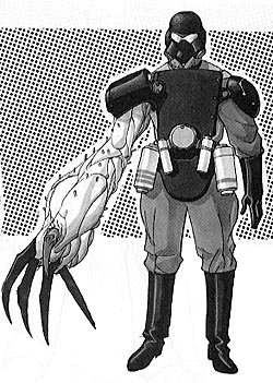 As we get further into The Johnson Sketchbook, though, what we see is a more technical and precise side to Johnson’s creations. Now instead of anything and everything, we get model sheets for robots, aliens, and spacecraft, showing us the creations with different angles and configurations. Here Johnson uses a beautiful fine line to create precise, gorgeous designs; there’s a lot of detail and care put into these drawings. At the same time, even in its most serious Johnson still allows the fun of the earlier pages to come through. Sometimes it’s little more than a muttering of a character saying, “I’m bad” but you still get that chuckle from Johnson just when he wants it.
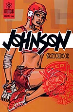
 My one big complaint about The Johnson Sketchbook actually surprised me because it was the one thing I’d have assumed would be perfect, and that’s… the cover. Don’t get me wrong, his cover painting is nice looking, but it’s nothing like the Johnson covers that I’ve grown to expect with its amazing design aspect and inventiveness. This just seems… well, ordinary. Even worse, the logo is blocking part of the cover character’s outfit. It’s strange to see such a misfire from one of the best cover artists in comics. Still, overall, this is a fun little look into the creative mind and process of a talented creator.